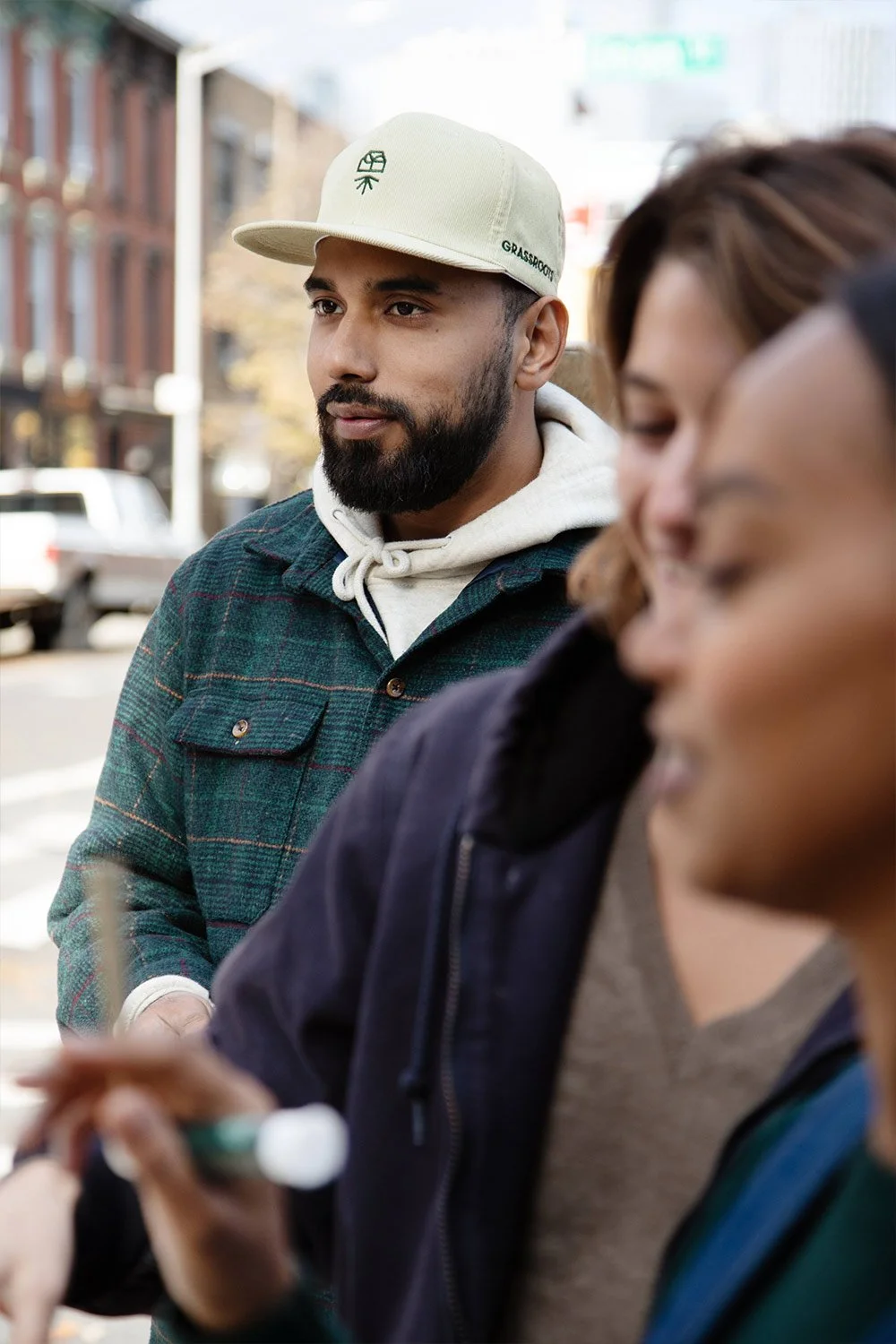
Grassroots
Bringing It Back To Our Roots
Role
Branding | Strategy | Creative Direction | Art Direction | Graphic Design | Packaging

-
It All Started in a Small House in Illinois…
Within the region, Grassroots had cultivated a reputation for delivering exceptional craft cannabis. Poised for a nationwide launch, its visual identity and brand essence failed to forge connections with untapped audiences. The brand demanded a comprehensive redesign, accompanied by a compelling narrative, communication strategy, and identity to effectively introduce the brand to a broader community.
Challenging Convention
Thanks to the West Coast’s early embrace of cannabis legalization, successful brands there had already set a trend for a distinct visual vernacular. The aesthetic typically combined laid back West Coast vibes with inspiration from Southwest folk art or hippie dippie illustrations. As cannabis legalization gained momentum across the U.S., the need to establish Grassroots with a distinctive and recognizable brand perspective became critical for sustained success in an evolving landscape.
Confidence Comes from Knowing Yourself
In transforming the Grassroots community’s perception, I identified a shared ethos among Millennials and Gen Xers, an appreciation for brands that embody honesty, transparency, and a focus on product quality. Recognizing Grassroots’ natural alignment with these values, my approach centered on refining the brand’s communication and instilling a sense of confidence.
The journey led me, paradoxically, back to our origins, both in narrative and region, the Midwest. There, I unearthed a trove of inspiration that provided a solid foundation for the brand’s reconstruction.
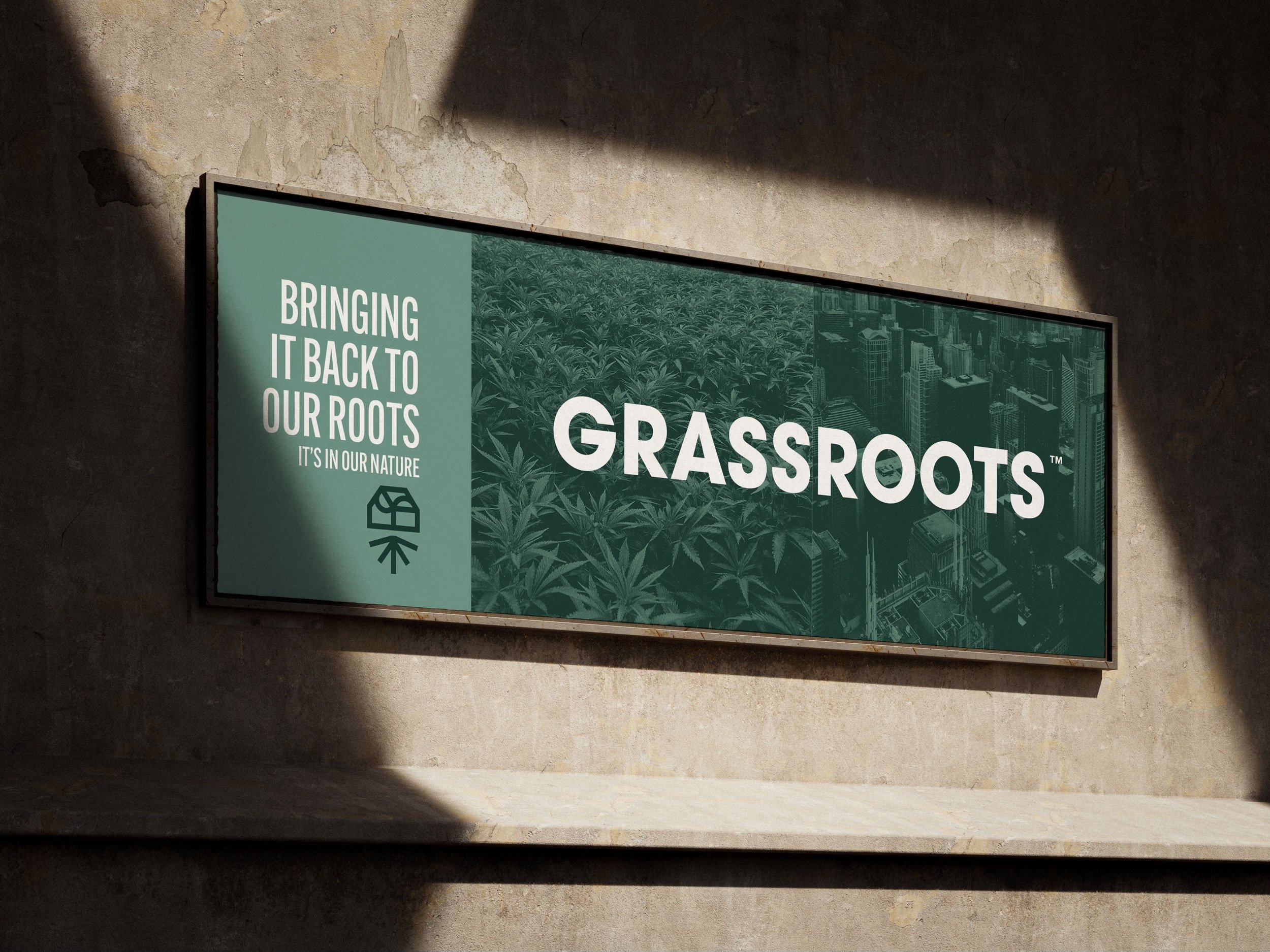
Drawing from the rich design legacy of midcentury modern “Chicago style,” I embraced an enduring Midwest aesthetic heavily adopted from the 1960s onward. This era witnessed the rise of international sans serif typography and bold, stroked symbols, principles I seamlessly integrated into the brand identity and iconography. The symbol became more than a mark. It evolved into a visual narrative of Grassroots’ story, crafted within a home, cultivating plants, and rooted deeply in community.
Naturalist at its core, the brand’s commitment to the craft of cannabis and its best in class strains and genetics found expression through an earth toned color palette inspired by nature.
Building upon the Chicago style foundation, I also drew from the artistic and humanistic design language of the city’s jazz scene. That infusion of creative energy informed the refined layout system, thoughtfully structured design quadrants, and harmonious typographic rhythm, elevating Grassroots into a brand with a distinct sense of artfulness and expression.


Additional Credits
Agency: Dinner Party
Client: Curaleaf
Photography: Sunny Shokrae
Collaborators:
Jeff Tammes, Braden Turrentine,
Jordan Braun, Zach Granowitz
Next Project
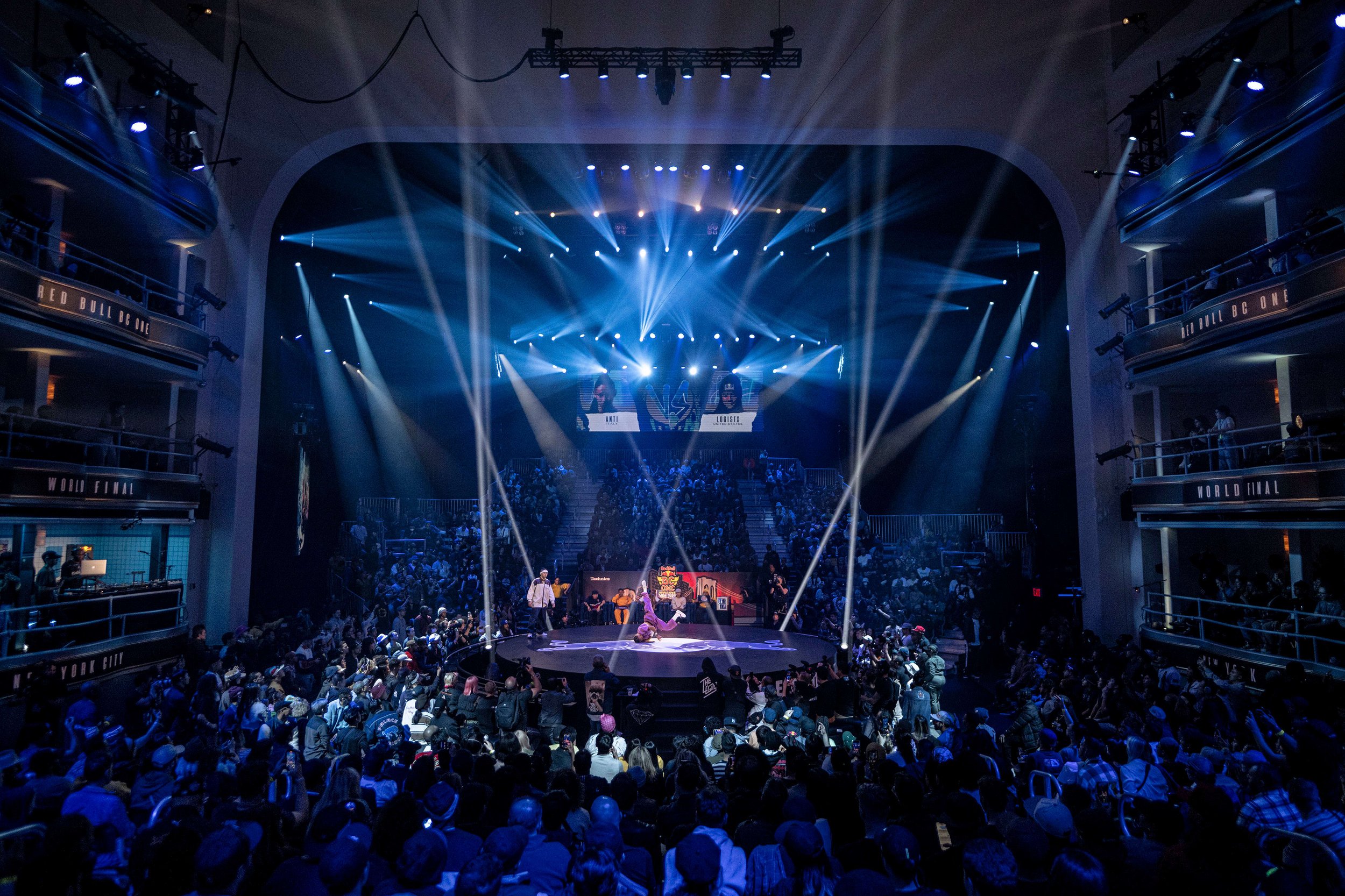
Red Bull BC One
Global & World Final
Creative Direction