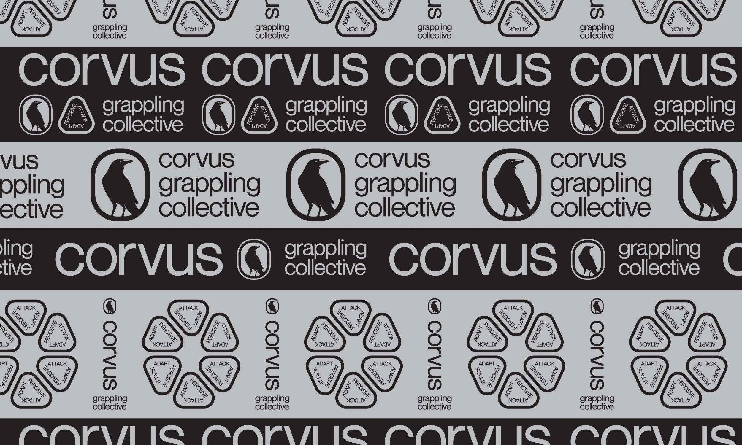
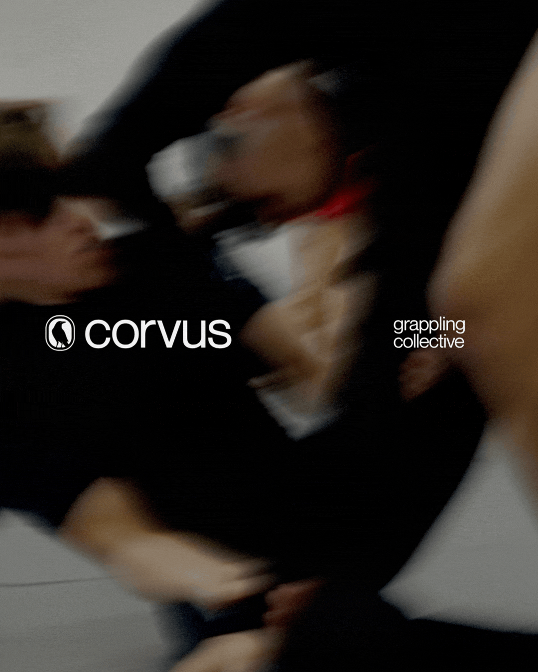
Corvus Grappling Collective
Perceive. Attack. Adapt.
Role
Branding | Strategy | Creative Direction | Graphic Design | Social Media | Merchandise | Uniforms
Corvus was born inside a culture defined by lineage and legacy, but founder and head coach Andris Brunovskis was not interested in repeating what already exists. He set out to build a new kind of training space grounded in problem solving, adaptability, and real skill development.
The opportunity was not to modernize aesthetics. It was to rethink the gym through the lens of the Constraints Led Approach and design an identity that reflects how Corvus trains: adaptive, intelligent, and collectively driven.
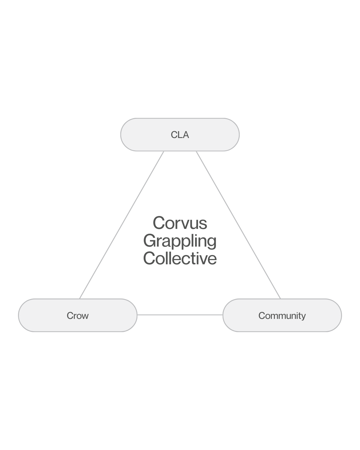
THREE CONVERGING FORCES
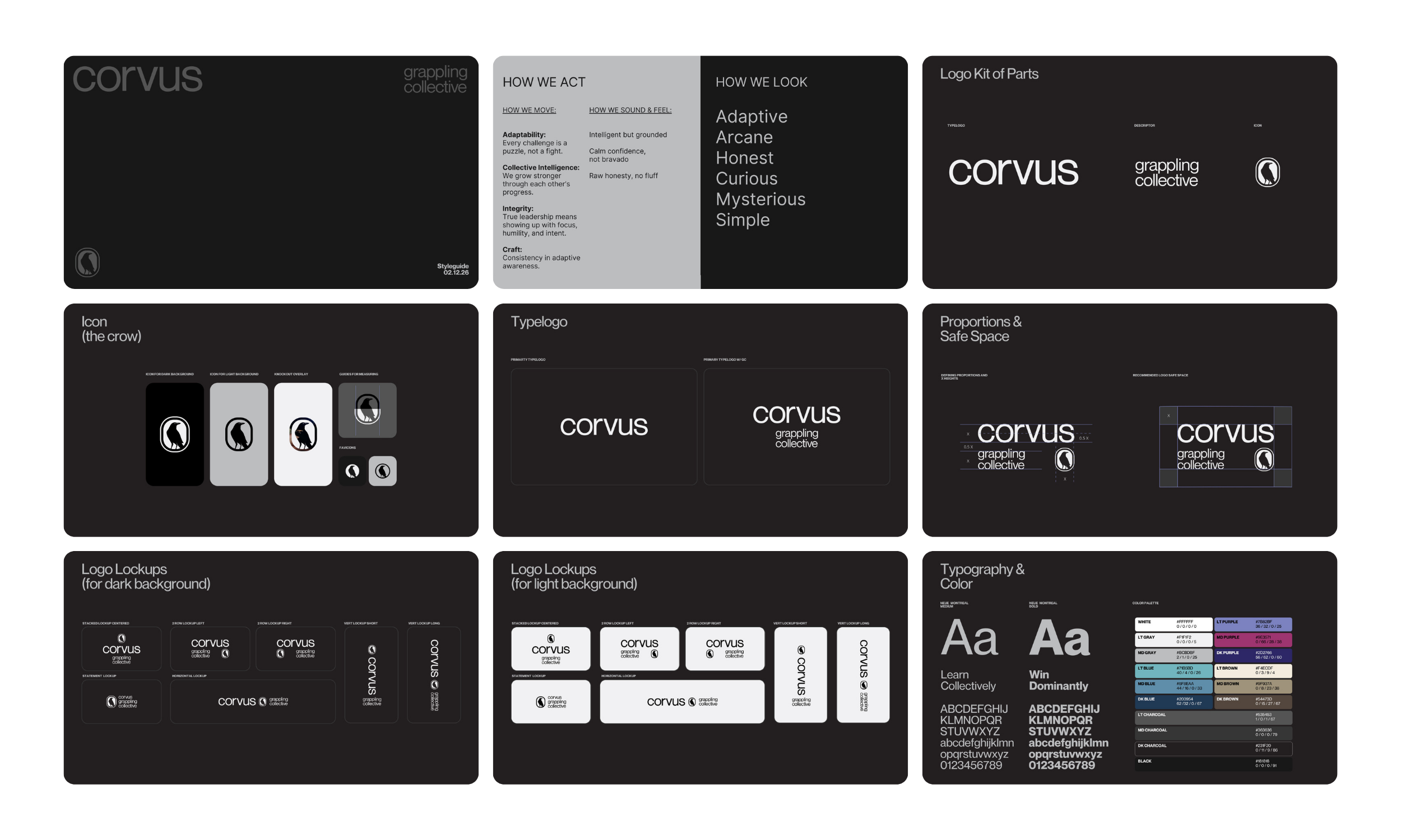
Three core ideas shape the foundation of Corvus. CLA is the North Star of the gym, grounding every practice in adaptation through a Constraint Led Approach. The Crow represents adaptive cognition, shared and sustained, reflecting intelligence in motion. Community turns that intelligence into lived culture, where learning compounds and growth is collective. At the center of it all is Corvus, the convergence of philosophy, symbol, and people.
FROM THIS CONVERGENCE,
A CLEAR DIRECTION EMERGED:
ADAPTIVE AWARENESS.
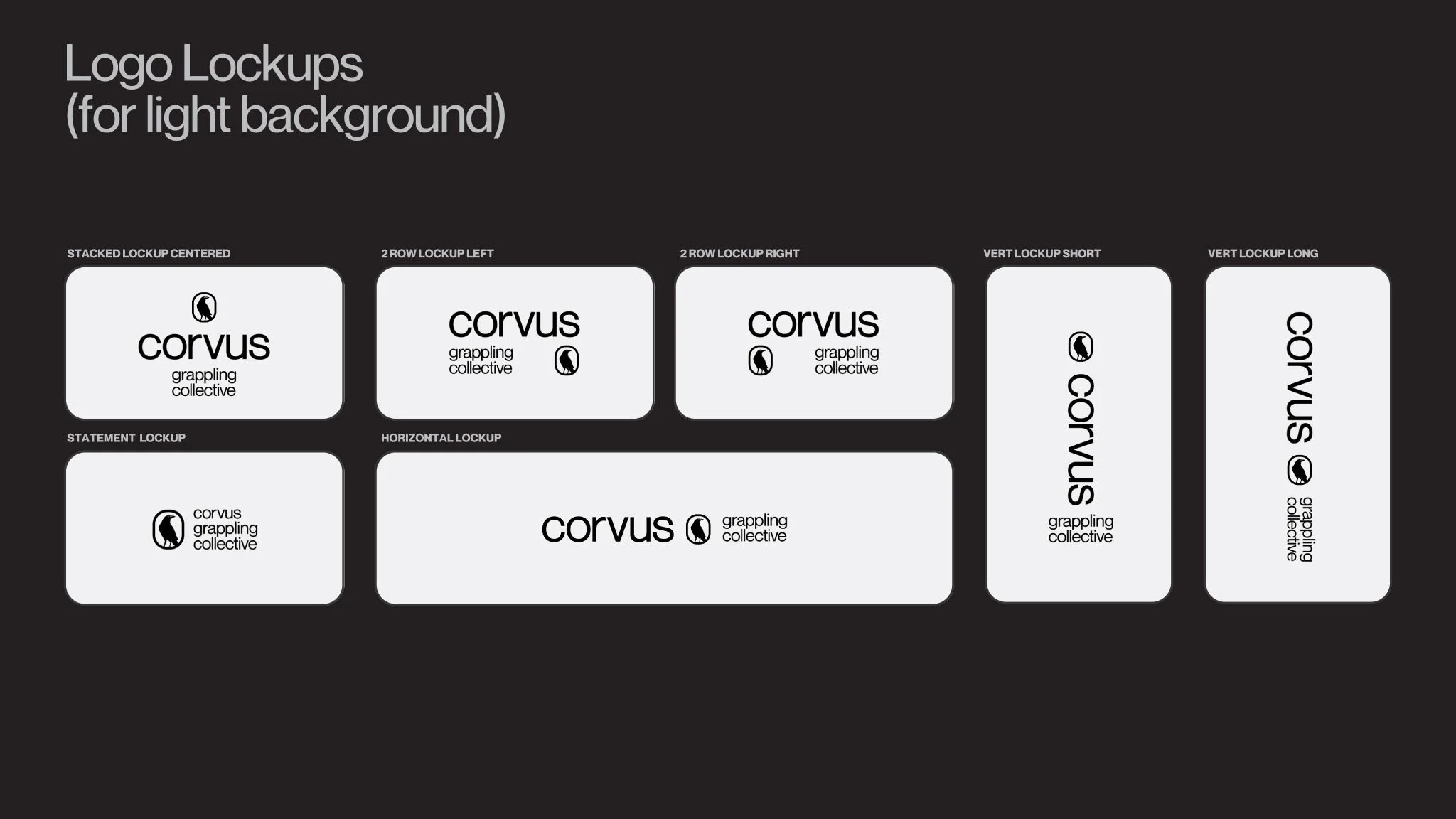
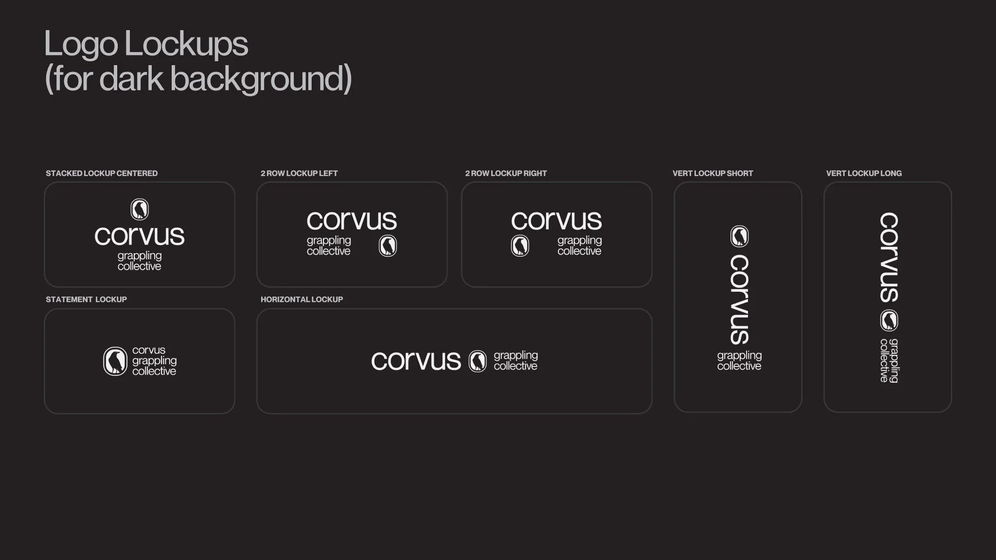
Adaptive by Intention.
Modular by Design.
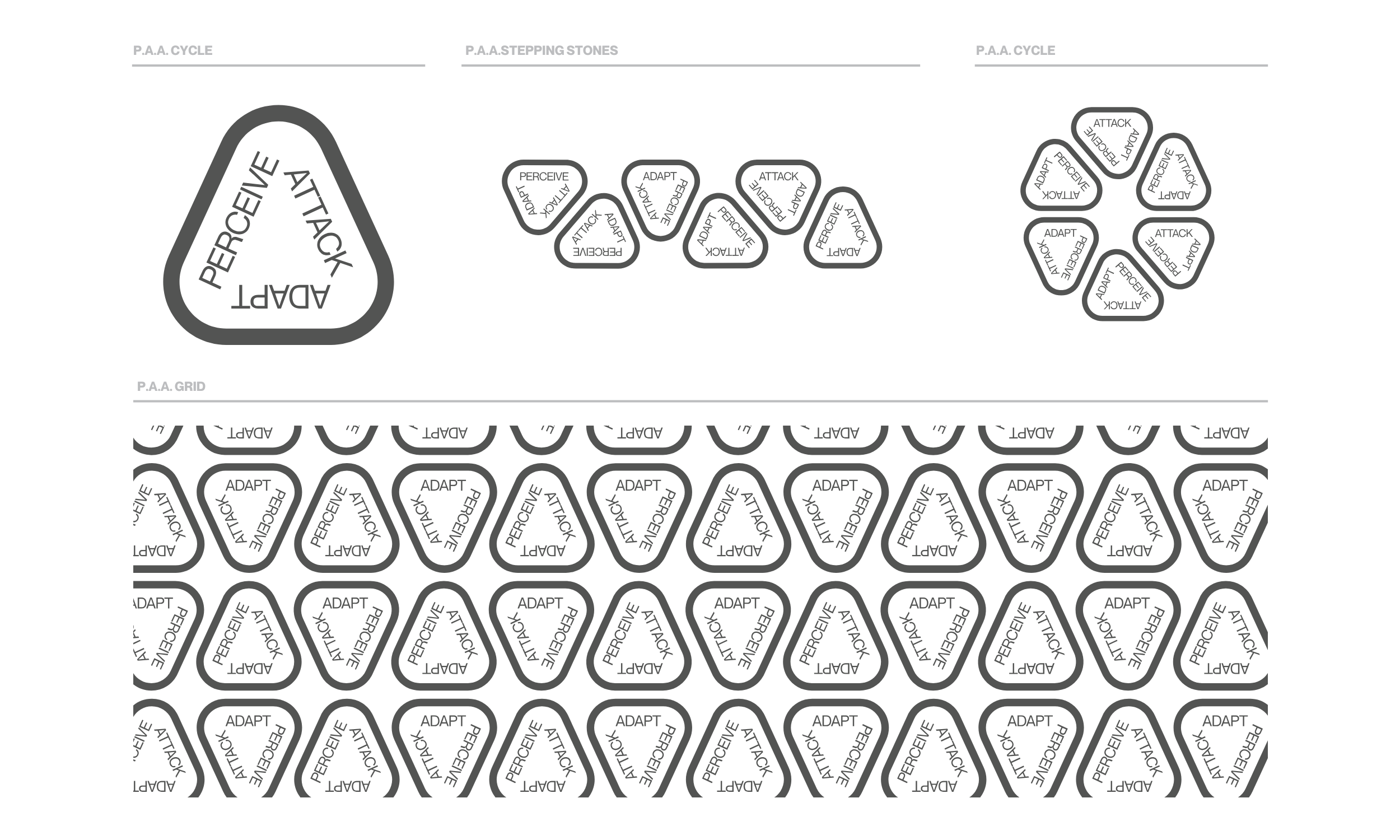
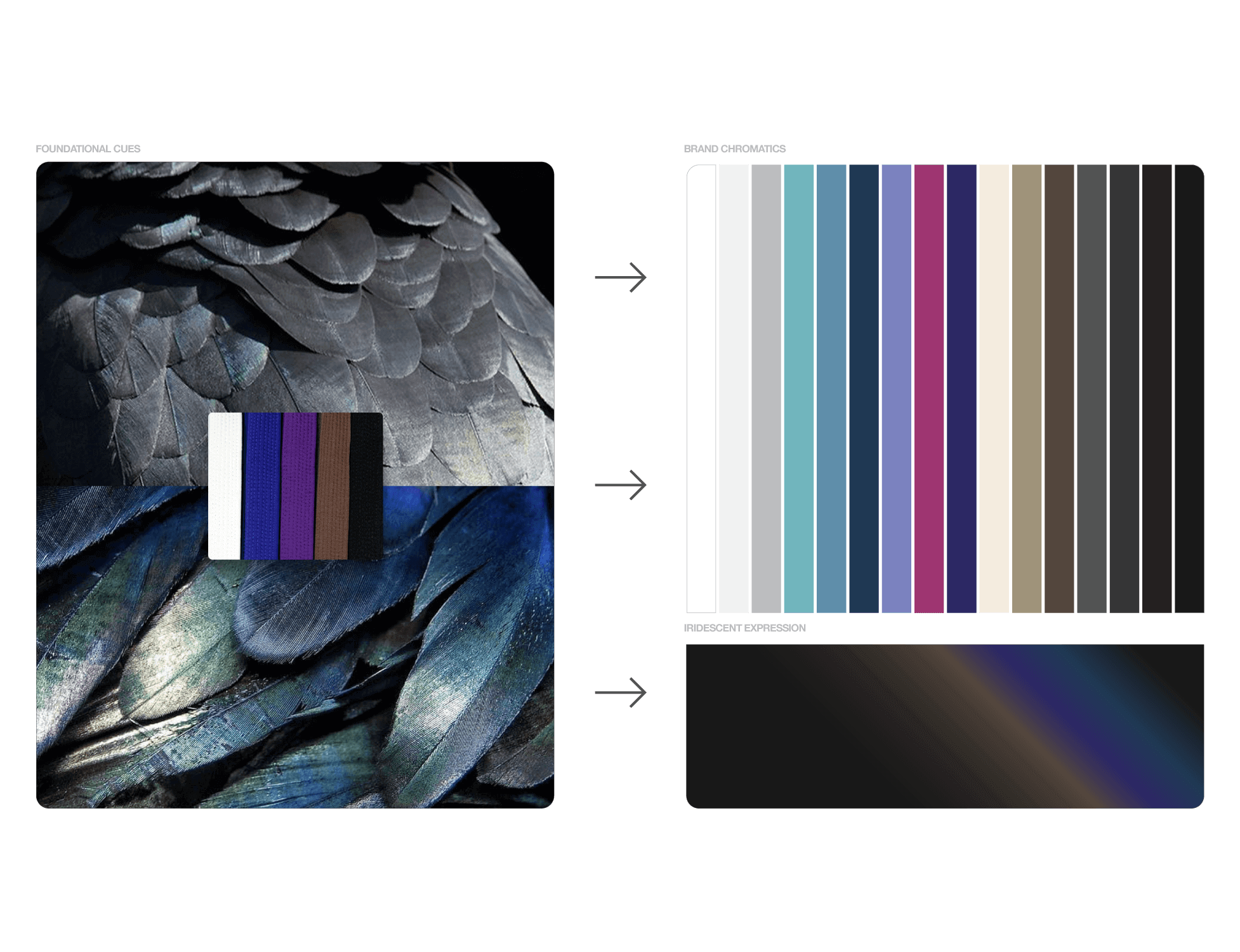
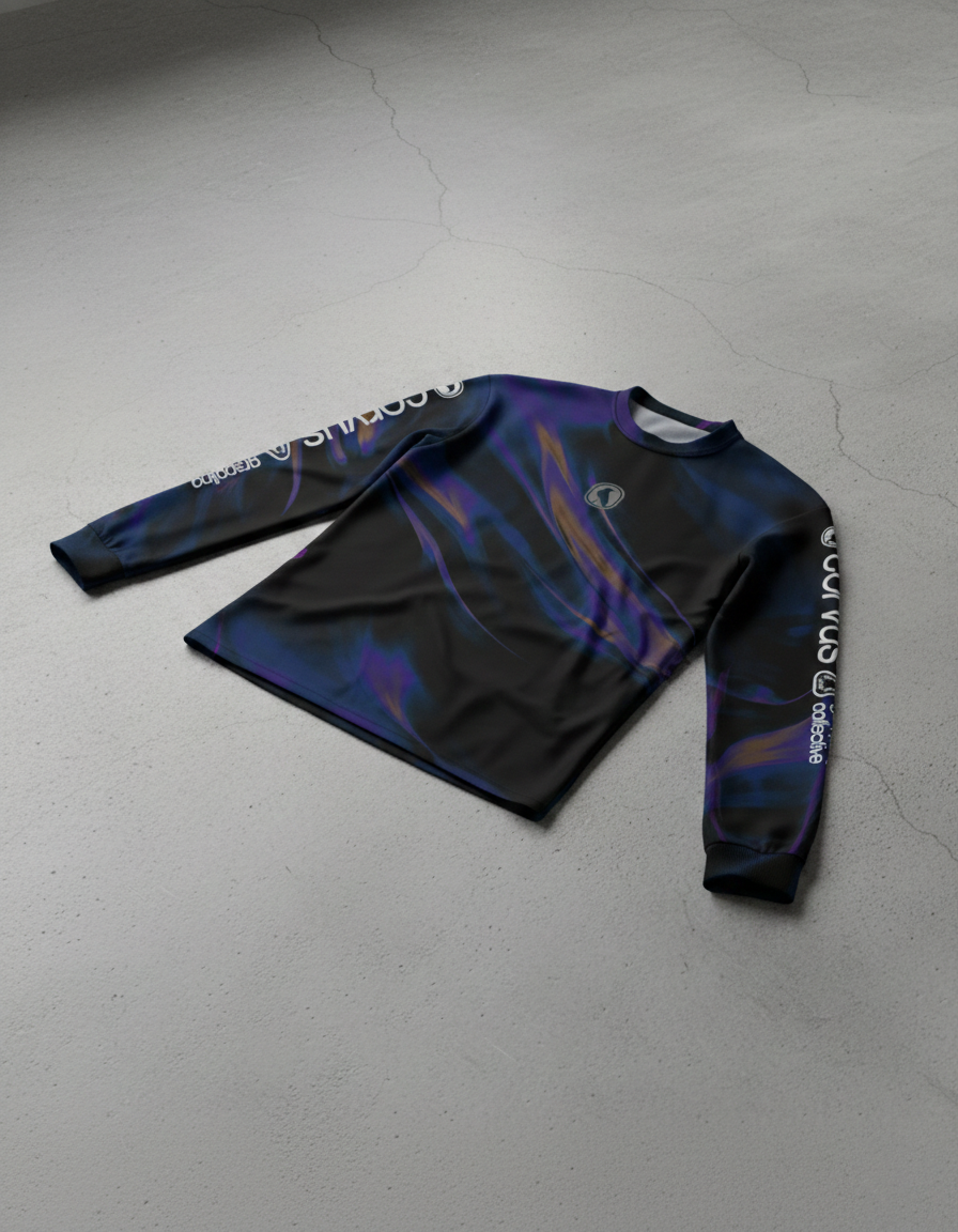
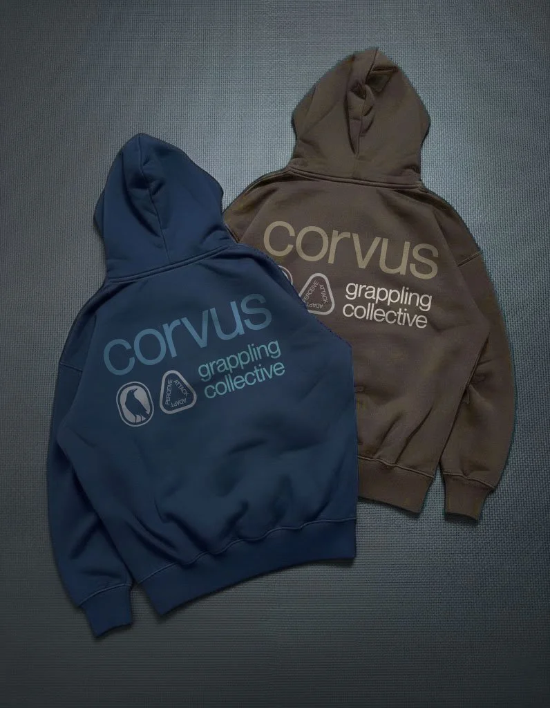
Rooted in the crow’s tonal range and structured through Jiu Jitsu belt hierarchy, the chromatic system anticipates competitive uniform constraints while activating through blocking, iridescent expression, and atmospheric gradients.

Additional Credits
Corvus Grappling Collective
Andris, Allen, Michael

Next Project
Sherpa LW Refresh
The Grounded Navigator