Sherpa LW Refresh
The Grounded Navigator
Role
UX / UI | Product Design | Strategy | Brand Design | Creative Direction
FINDING DIRECTION WITHIN CONSTRAINTS
When I joined the project, the brief was intentionally constrained: Focus on color and typography for a mobile product design.
While minimal in scope, this was an opportunity to uncover deeper creative foundations that could scale with the product as it evolves.
The Objectives:
Define a clear and distinctive visual identity.
Unite function with personality.
Build a scalable framework and strategy.
About Sherpa
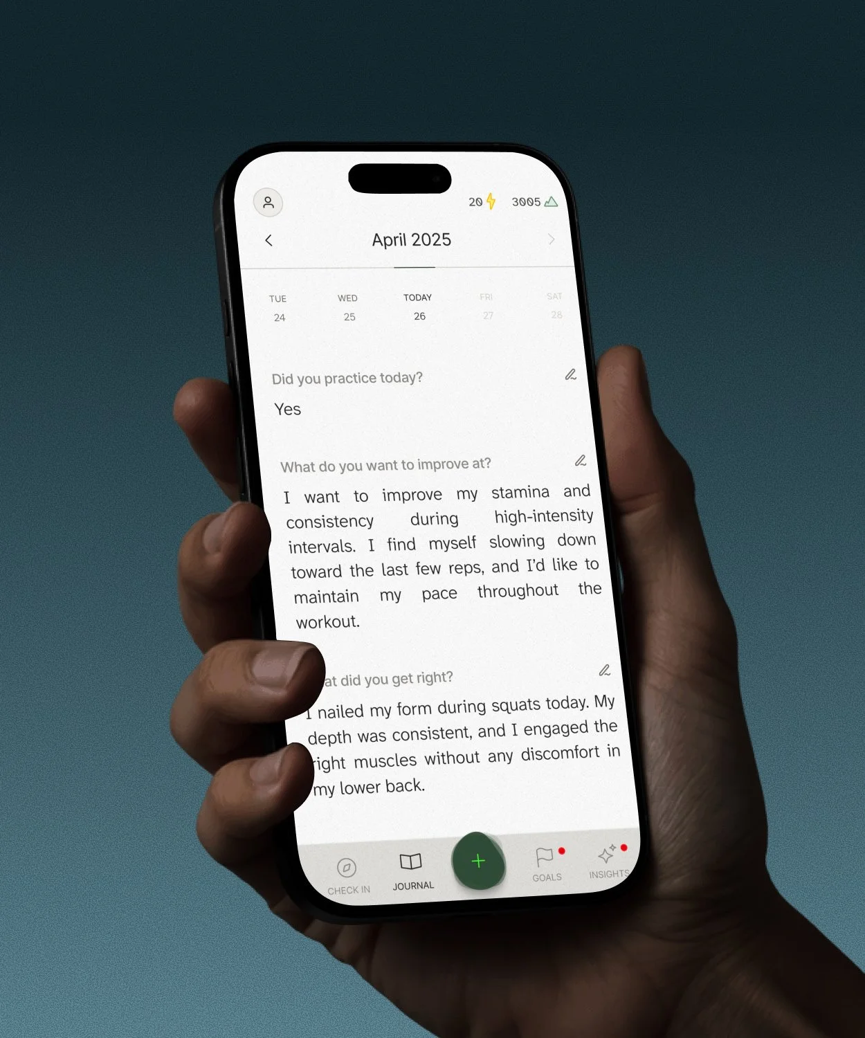
Sherpa is a performance and reflection app designed to help athletes and high performers track progress, process feedback, and build consistency over time. By blending guided journaling, data insights, and AI-supported reflection, Sherpa acts as a personal coach, helping users navigate their growth with clarity, confidence, and calm.
I began by analyzing user interviews from the existing design, uncovering key emotional patterns in how users engaged with the product.
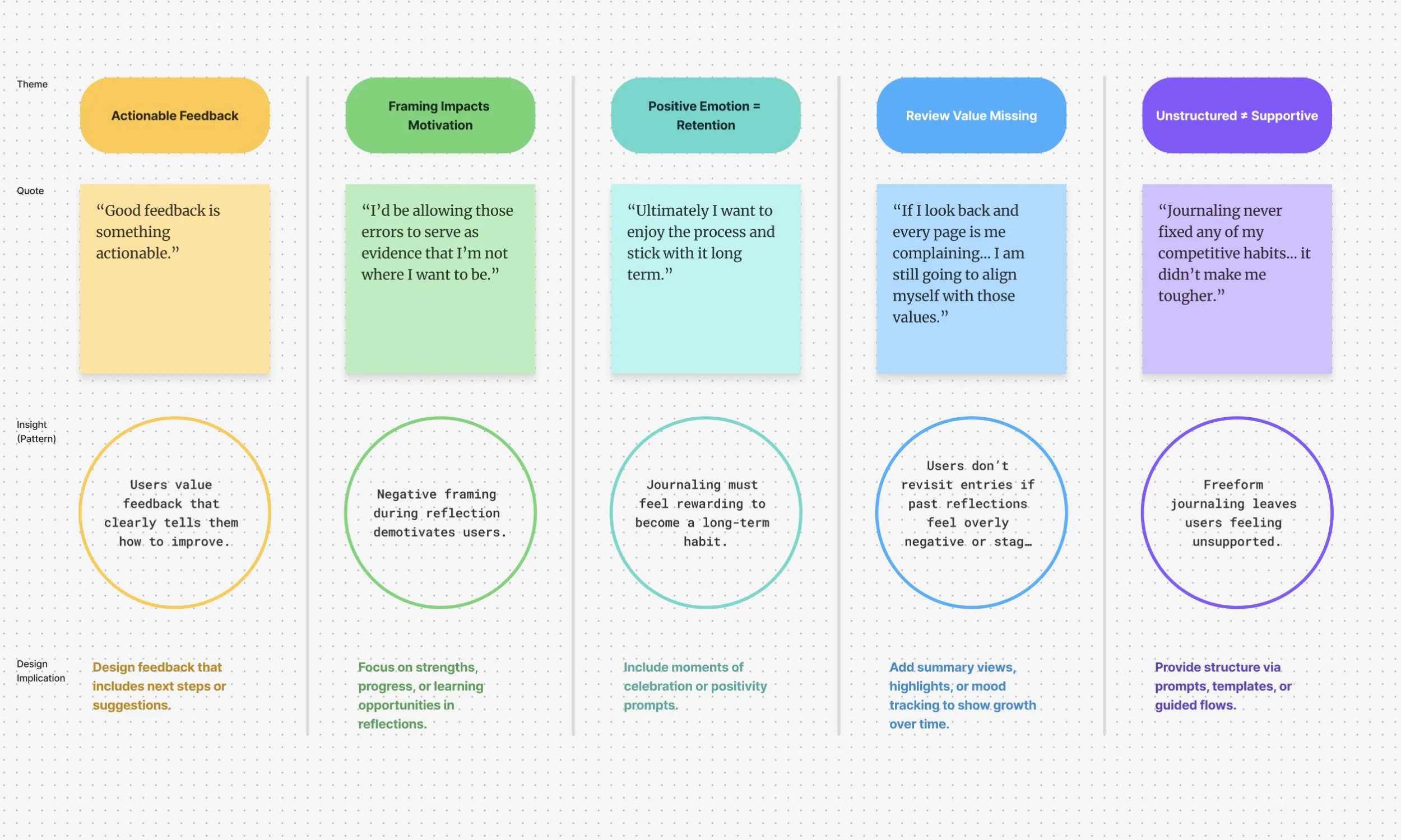
“Ultimately I want to enjoy the process and stick with it long term.”
These insights showed me that users don’t just want a space to record thoughts. They need a product that frames their experience in a positive, guided, and motivating way. The creative direction had to establish not only clarity and usability but also a sense of grounding.
UNDERSTANDING THE GAPS
The pain points were not simply design flaws.
They were strategic issues:
EMOTIONAL DRAIN
Negative framing left users feeling demotivated rather than supported.
LOW ENGAGEMENT
Without delight or a sense of progress, users quickly abandoned tools.
FRAGMENTED VISUALS
A lack of cohesive design language mirrored the lack of cohesive experience.
These pain points underscored the opportunity to use design as more than styling. It became a framework to ground users and guide them forward from being overwhelmed to grounded.
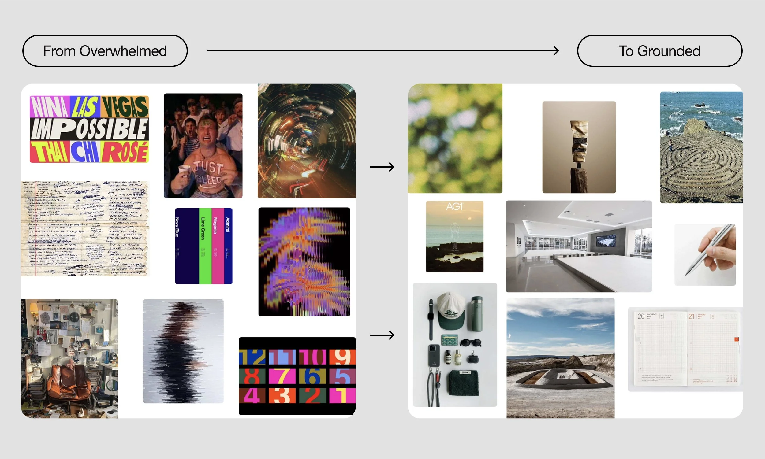
REFRAMING THE JOURNEY
With this North Star in place, I redefined the art direction across three pillars.
Color, typography, and iconography would be the first building blocks of this system. Their role was not to decorate but to establish structure, emotional resonance, and a consistent sense of guidance.
From these insights I defined a North Star.
To create a grounded and human centered design system that inspires calm, trust, and clarity.
This North Star would not only guide the immediate design work but also serve as a reference point for future growth.
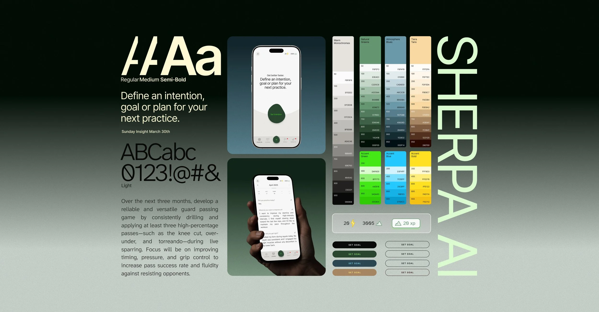
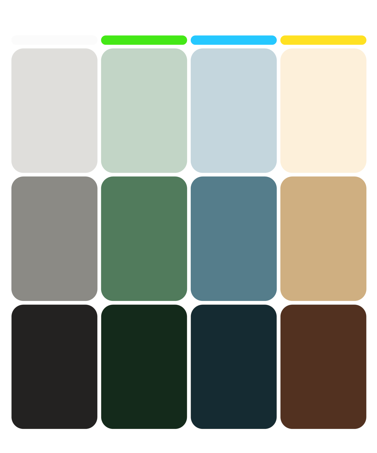
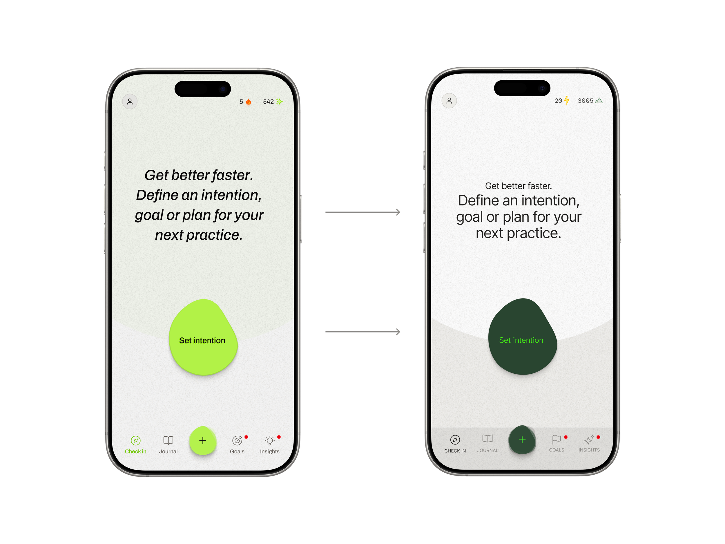
COLOR
Using natural earth tones inspired by a Sherpa’s ascent, the palette balances calm while allowing accents for momentum . Each color serves as an emotional cue to ground and guide the user.
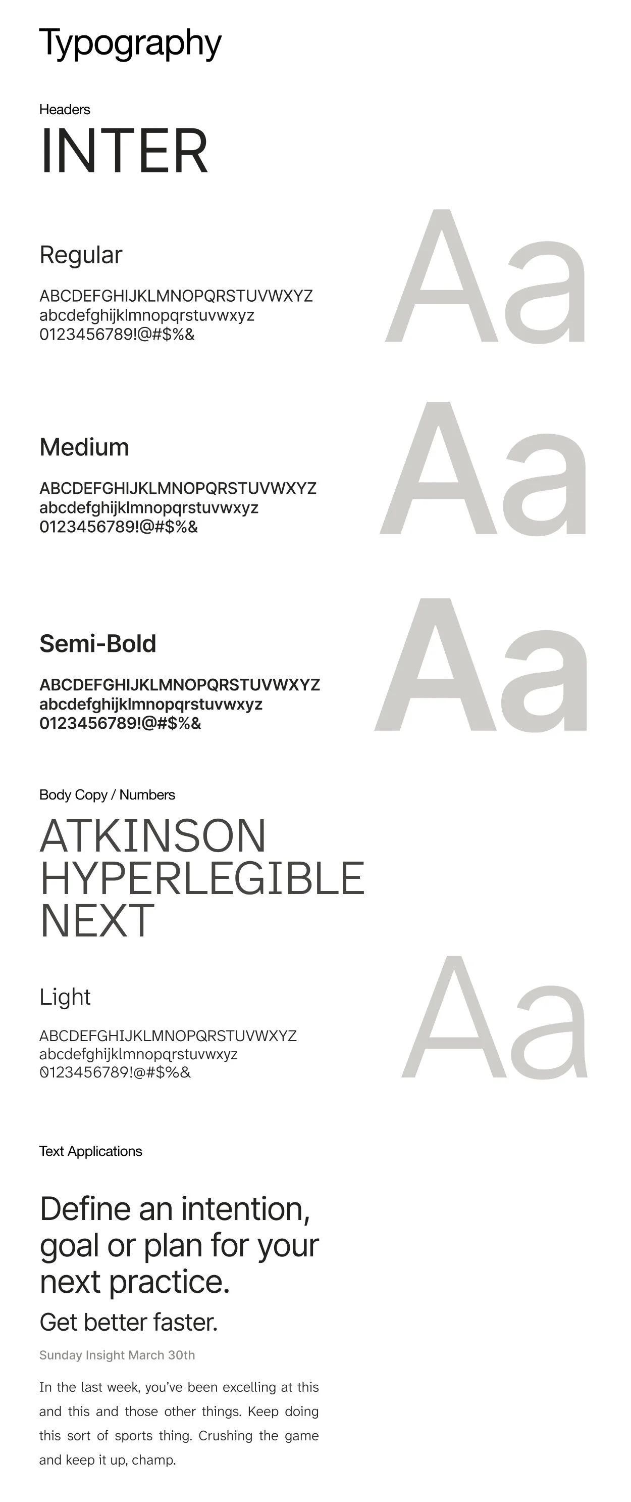
TYPOGRAPHY
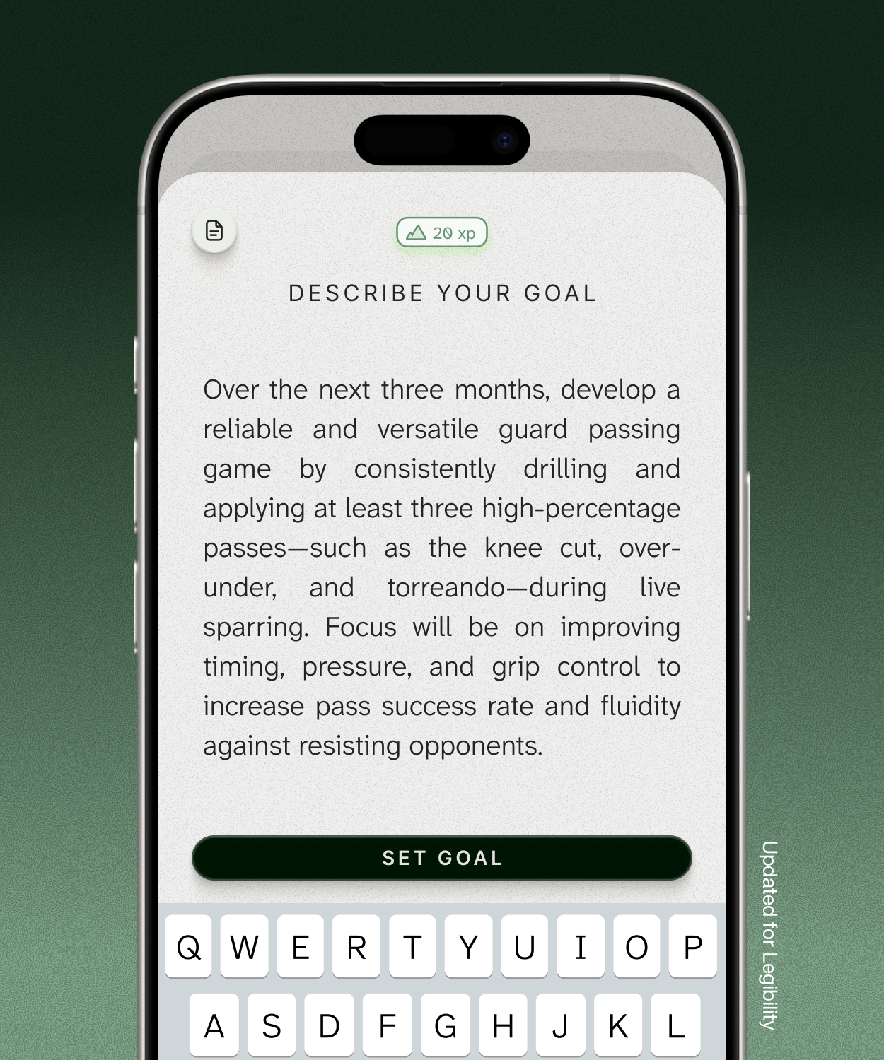
The typography system prioritizes legibility, ensuring effortless readability when users write and review entries or insights. The selected typefaces balance accessibility with a design-forward aesthetic, maintaining clarity without distraction. In this system, the user’s thoughts and intentions are the protagonist, the typography simply supports their journey.
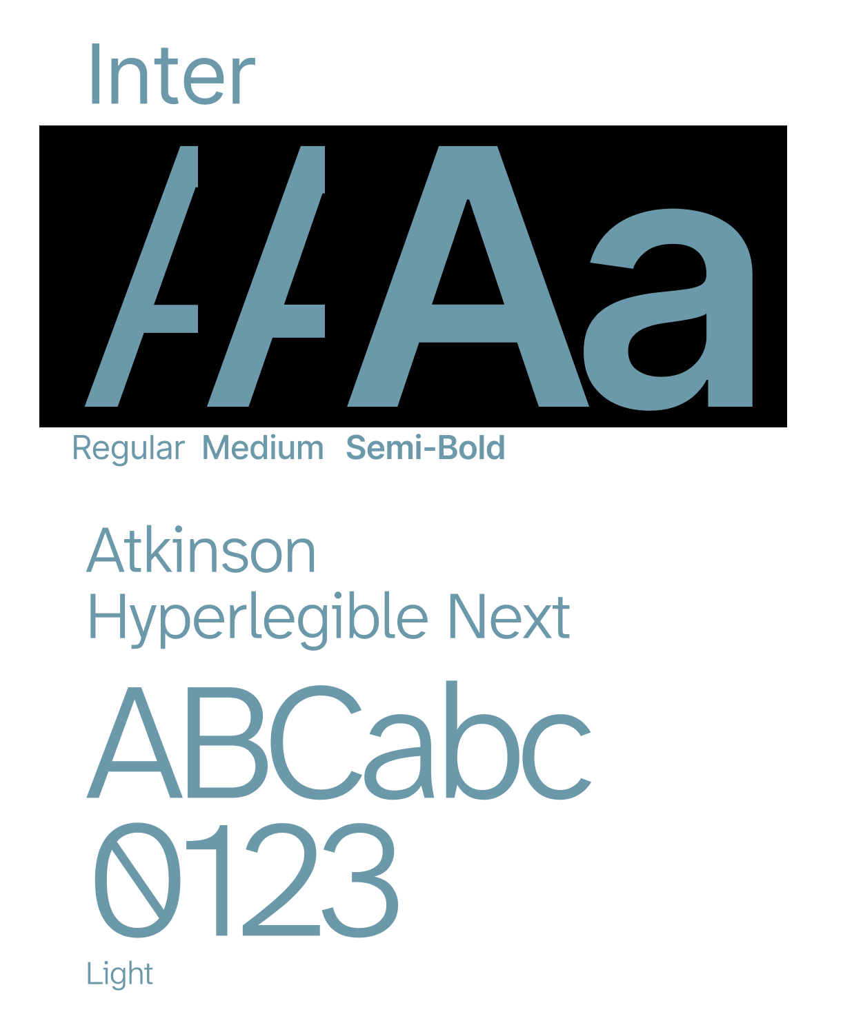
ICONOGRAPHY
The iconography system is built around guidance and progression. Each icon serves as a visual waypoint, offering direction and reassurance as users move through their journey. Consistent line work and gentle curves maintain clarity and calm across the interface.
A FOUNDATION FOR GROWTH
These choices created a cohesive design system that worked not only functionally but emotionally.
The product now has a design language that is not only recognizable but strategic.
Bringing the Vision to Life:
Defined a clear and distinctive visual identity through a unified North Star that connects design to user needs and growth.
Unified function and personality with a cohesive system of color, type, and iconography that builds trust and clarity.
Built a scalable framework and strategy that transforms the product from functional to guided and purposeful.
NEXT HORIZONS
This foundation will continue to guide not only the product but the brand, its storytelling, and the experiences around it. Resulting in a connected ecosystem that feels consistent, grounded, and alive.
This case study shows how a constrained brief became an opportunity to define a long term vision. By grounding design choices in user research and connecting them to a guiding strategy, the project delivered more than color and typography. It delivered a creative compass for the product’s future.
Additional Credits
Product: Sherpa
Client: Josh Hsu

Next Project
Grassroots
Branding & Identity